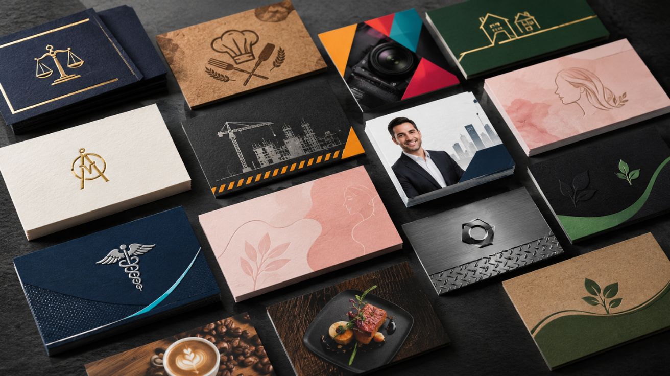

One of the most common design mistakes professionals make is treating their business card as a generic contact slip. Corporate executives expect different aesthetics than creative professionals or tech entrepreneurs. A lawyer needs understated elegance, while a graphic designer can experiment with bold, unconventional layouts. Understanding who receives your card shapes every design decision.
The card that wins in a law firm lobby would feel completely out of place at a hair salon. That’s why business card design by industry matters and why this guide exists.
Professional Services
The goal for professional service cards is trust before creativity.
Business professionals should use minimalist, refined and simple business card layouts to convey competence and build trust. Avoid playful typography, stick to conservative font pairings instead. Geometric shapes and pastel colours offer understated ways to add personality without undermining the professional tone.
What to include: Full name, credentials (e.g., CPA, Esq.), firm name, direct phone, professional email, and website. For industries like law and real estate, licence numbers and credentials are not optional, they are critical trust signals that prove you are a legitimate professional.
Design direction: 18–24pt white or cream cardstock, navy or charcoal colour palette, serif or clean sans-serif font, matte or soft-touch finish. No photography, no busy backgrounds.
Creative Industries Design, Photography, Marketing, Advertising
This is where personality earns its place on the card.
Creative professionals should showcase creativity with bold fonts and colours cards that are bright, funky, and even a bit daring can effectively showcase individuality. Interesting shapes, bold typography, and premium textures all signal the kind of creative thinking clients are hiring you for.
What to include: Name, creative title, portfolio QR code, Instagram handle (if it’s a professional showcase), and website. Skip the physical address entirely.
Design direction: Mixed typography, bold colour blocking, holographic or soft-touch finishes, or a custom die-cut shape that reflects your medium. Warm neutrals cream, sand, warm grey project approachability and work well for creative professionals and lifestyle businesses.
Trades and Home Services
Trade cards need to communicate reliability, availability, and local credibility instantly.
Bold typography paired with metal-inspired surfaces creates a sleek, futuristic look projecting strength, professionalism, and resilience the a natural fit for construction, trades, and any brand seeking to convey durability.
What to include: Business name prominently, your trade licence number, mobile number (large and readable), service area, and a QR code linking to reviews or a booking page.
Design direction: Dark base navy, charcoal, or black with bold white type. High-contrast and readable at a distance. Avoid script fonts entirely. 16–18pt gloss or laminate stock for durability.
Beauty and Wellness
Beauty and wellness businesses benefit from on-trend typography and gloss finishes. Cards should reflect the aesthetic experience clients expect from the brand.
What to include: Your name and specialty (e.g., “Balayage Specialist”), salon name, phone, Instagram handle, and a QR code opening your before-and-after photo gallery. Appointment reminder cards serve two purposes for stylists, manicurists, and estheticians, they work as visible tools people keep on display rather than store away.
Design direction: Blush, sage, or deep jewel tones. Script or editorial typography. Soft-touch matte for a luxury tactile feel. Add a booking QR on the reverse.
Food, Hospitality, and Restaurant
Cards in this space double as marketing tools.
Bakers and caterers can upload different product photos across multiple designs in one print run, solving the portfolio problem of displaying a range without separate card designs for each offering.
What to include: Business name, cuisine type or specialty, address, phone, website, and a QR code linking to the menu or reservation page.
Design direction: Warm tones of terracotta, cream, and deep red with a simple illustration of a signature dish. Kraft stock works beautifully for artisan food brands. Keep it tactile and appetising.
Real Estate and Property
Real estate is one profession where your face belongs on your card.
For face-to-face roles like real estate agents and insurance brokers, a headshot builds trust. Including a licence number isn’t just optional it proves you are a legitimate professional and clients expect to see it.
What to include: Professional headshot, full name, agency logo, mobile, email, licence number, and a QR code linking to your active listings.
Design direction: Clean and confident white or light grey base, brand colour accent, and readable serif name. The headshot should be editorial quality, not a casual photo.
Health and Wellness Physio, Therapist, Nutritionist, Personal Trainer
Cards here need to feel calm, trustworthy, and approachable.
Dark base colours project authority. Warm neutrals project approachability; the right call depends on whether your client needs to trust your expertise or feel comfortable opening up to you.
Design direction: Soft green, warm beige, or light blue palette. Clean sans-serif type. Cotton or uncoated stock for an organic, tactile feel. Add credentials clearly; clients in this space read them.
The Universal Rule Across Every Industry
Whatever your profession, three things apply to every great card in 2026. First, include only 5–7 elements maximum every extra item reduces the visual weight of the rest, and white space signals confidence while crowded layouts signal uncertainty. Second, always add a QR code that links to something genuinely useful a booking page, portfolio, or menu. Third, match your card’s quality to what you charge, a premium finish signals premium work before a word is read.
Exploring templates matched to your profession is the fastest way to start. Browse 400+ free industry-specific business card designs at ShareEcard organised by profession, print-ready, and free to download. For a complete business card design by industry solution, pair your printed card with a ShareEcard digital card via QR code, and your card works in person and online simultaneously.
FAQs
Why does business card design differ by industry?
Because every industry communicates a different value to its clients trust, creativity, reliability, or approachability. A card that looks right for a creative agency looks wrong for a law firm. Matching your design to your industry signals that you understand your own profession.
What should a tradesperson include on their business card?
Business name, trade licence number, mobile number in a large font, service area, and a QR code linking to Google reviews or a booking page. Bold, high-contrast design on durable laminate stock.
Should a hair stylist put their photo on their business card?
It’s optional for stylists an Instagram QR code linking to your work gallery is more effective. Reserve the headshot for real estate agents, therapists, and other face-to-face trust-dependent roles.
What colour works best for health and wellness business cards?
Soft greens, warm beige, and light blue project calm and approachability. Avoid corporate navy or black they create distance rather than the openness wellness clients expect.
How many details should I put on a business card?
No more than 5–7 elements. Name, title, phone, email, website, and a QR code is the ideal set for most professionals. Every additional element competes for attention and reduces the impact of the rest.
Read More: Why a British Heatwave Is the Worst Time to Be a Small Shop Owner


Leave a Comment